OBAGA
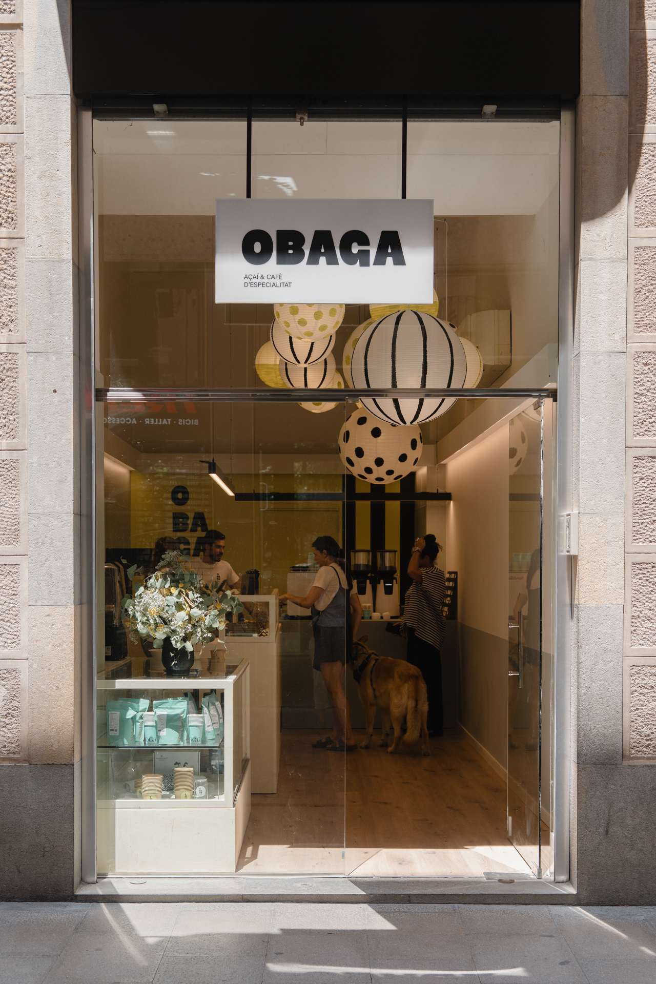
Obaga is the side of the mountain that remains in the shade: a pleasant, cool and sheltered place where you can rest and nourish yourself. This meaning is the starting point of the project and shapes an urban refuge in the centre of Girona, dedicated to açaí, speciality coffee and matcha tea.
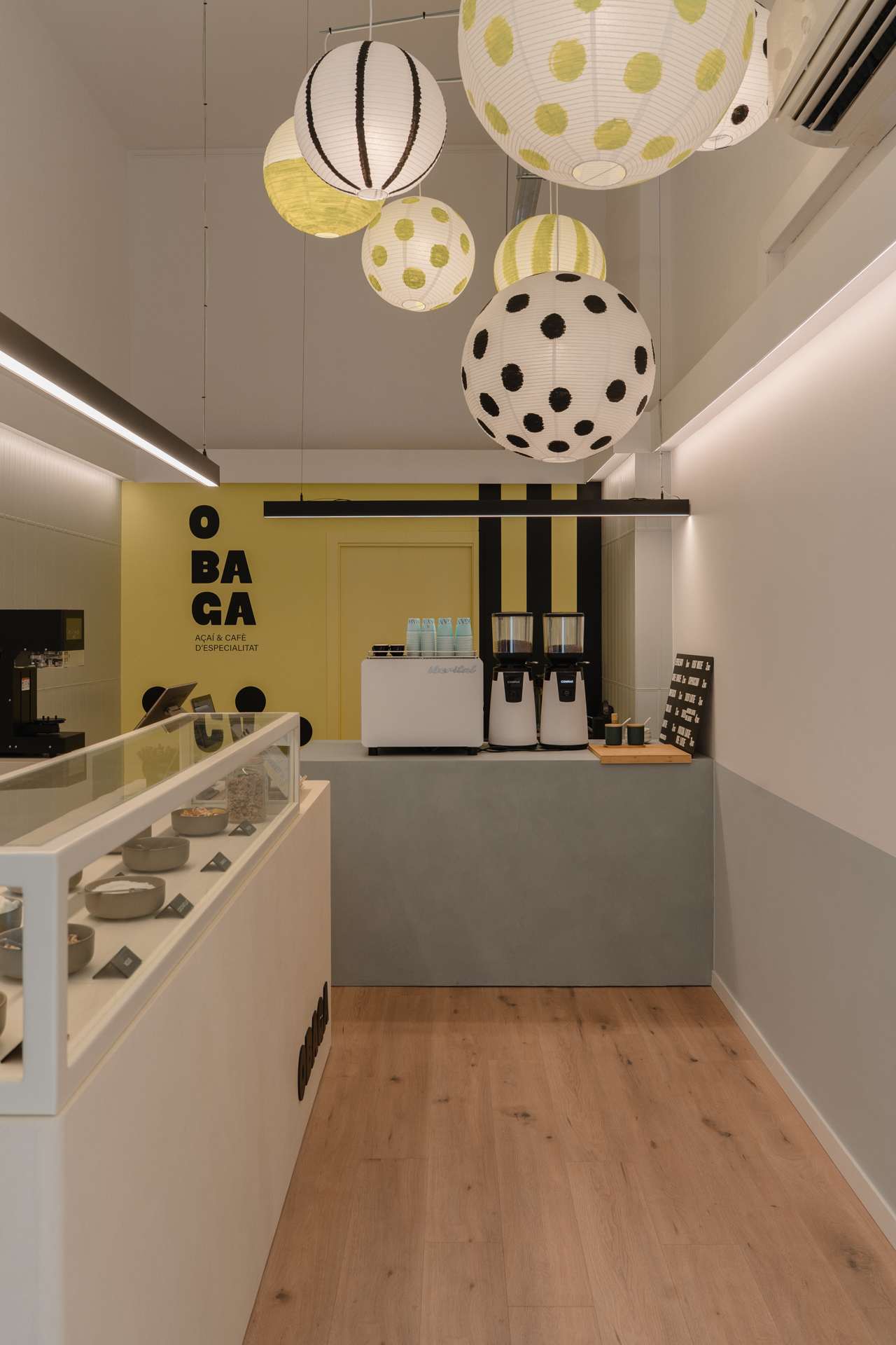
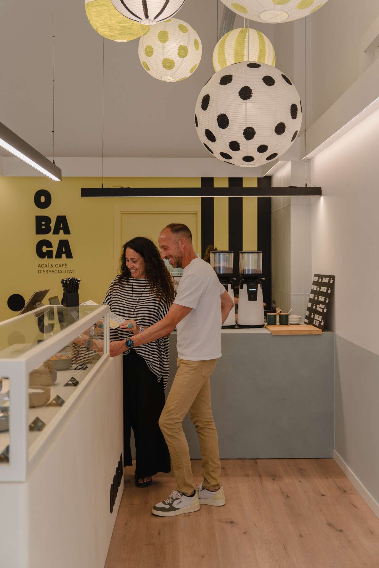
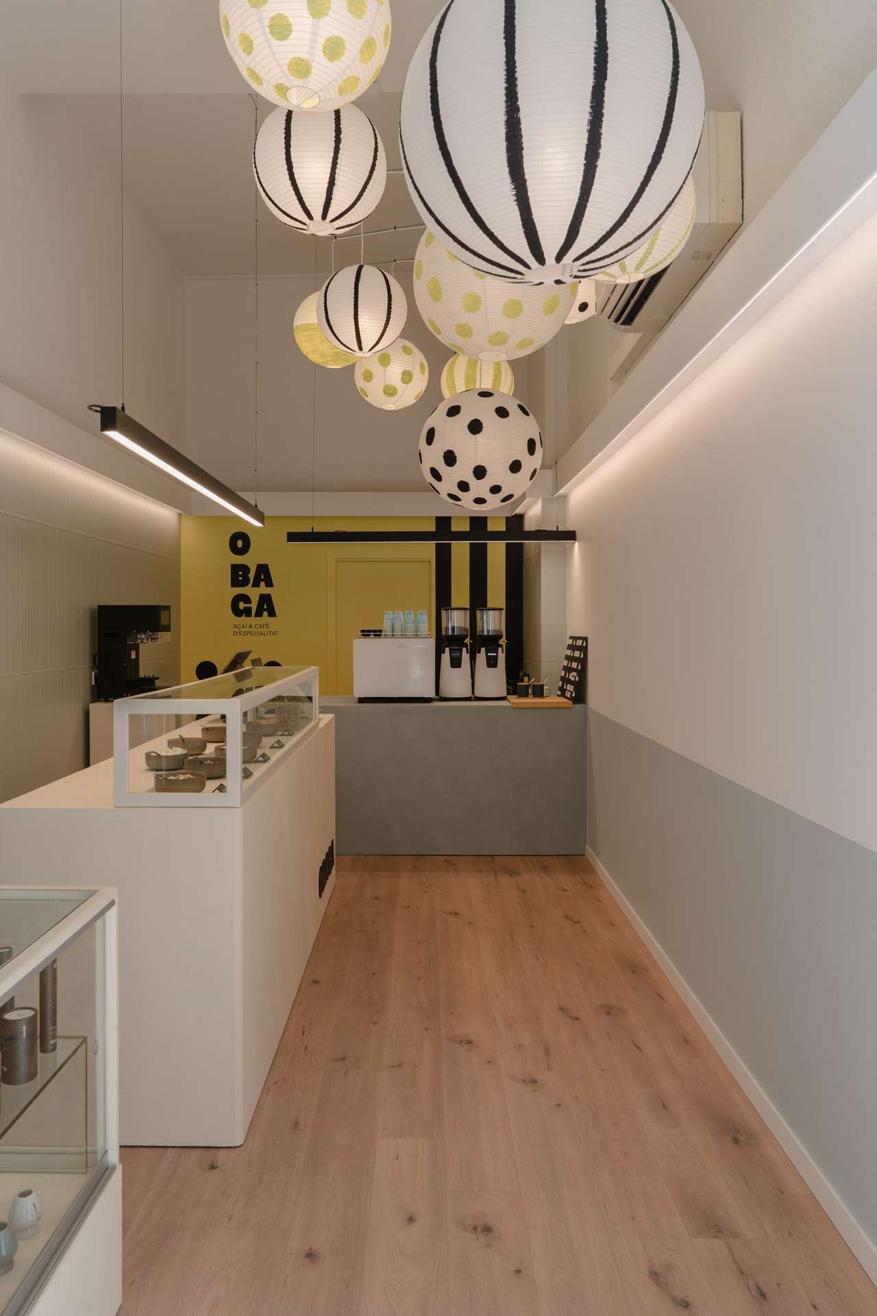
We want it to be a space devoted to nourishment, presented through a fresh and creative language. As a takeaway, OBAGA needs to work efficiently and be understood quickly. The interior design project is based on an analysis of the customer journey and the team’s operational needs in order to organise the different stages of the experience: entering, discovering the offer, choosing, placing an order and collecting it.
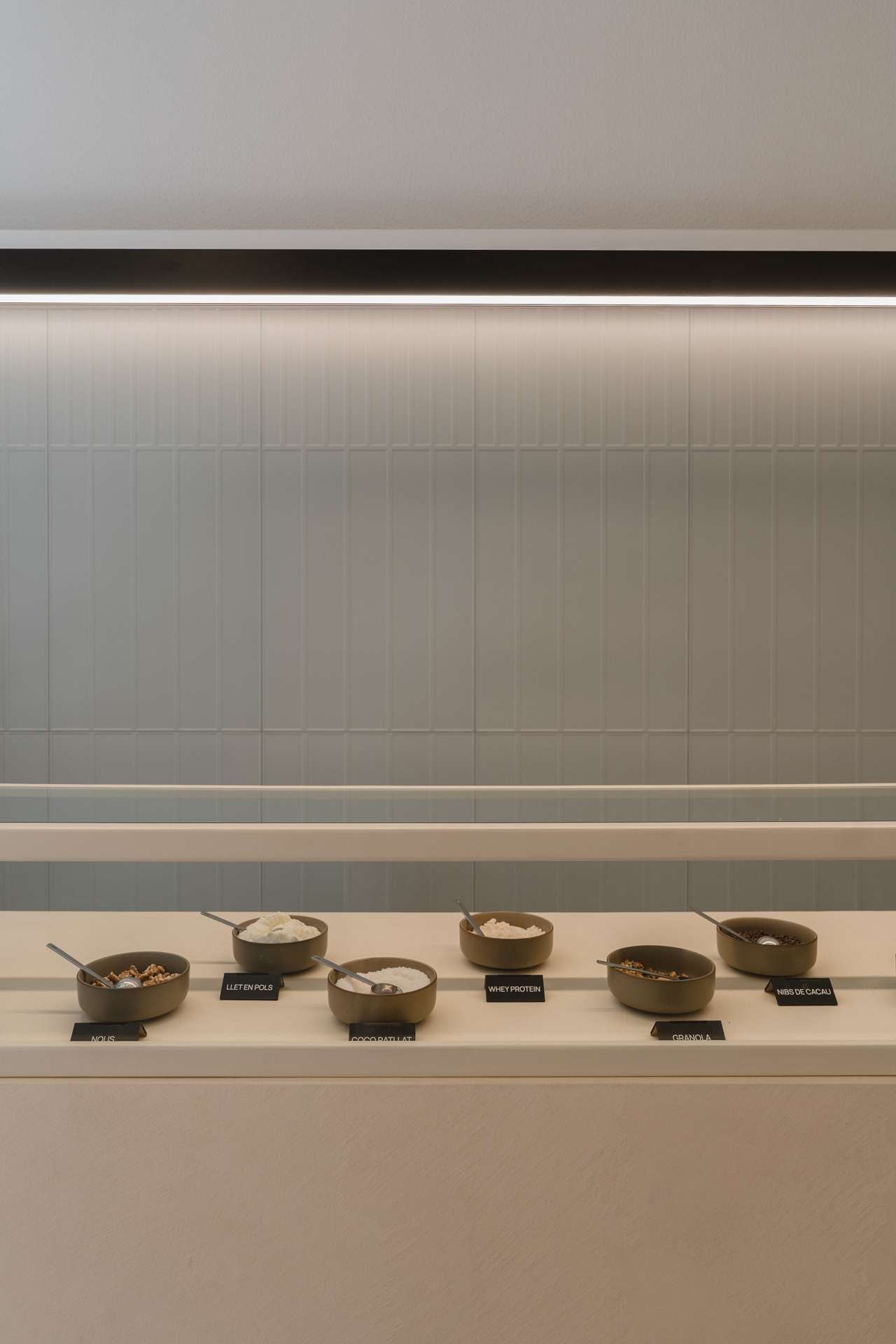
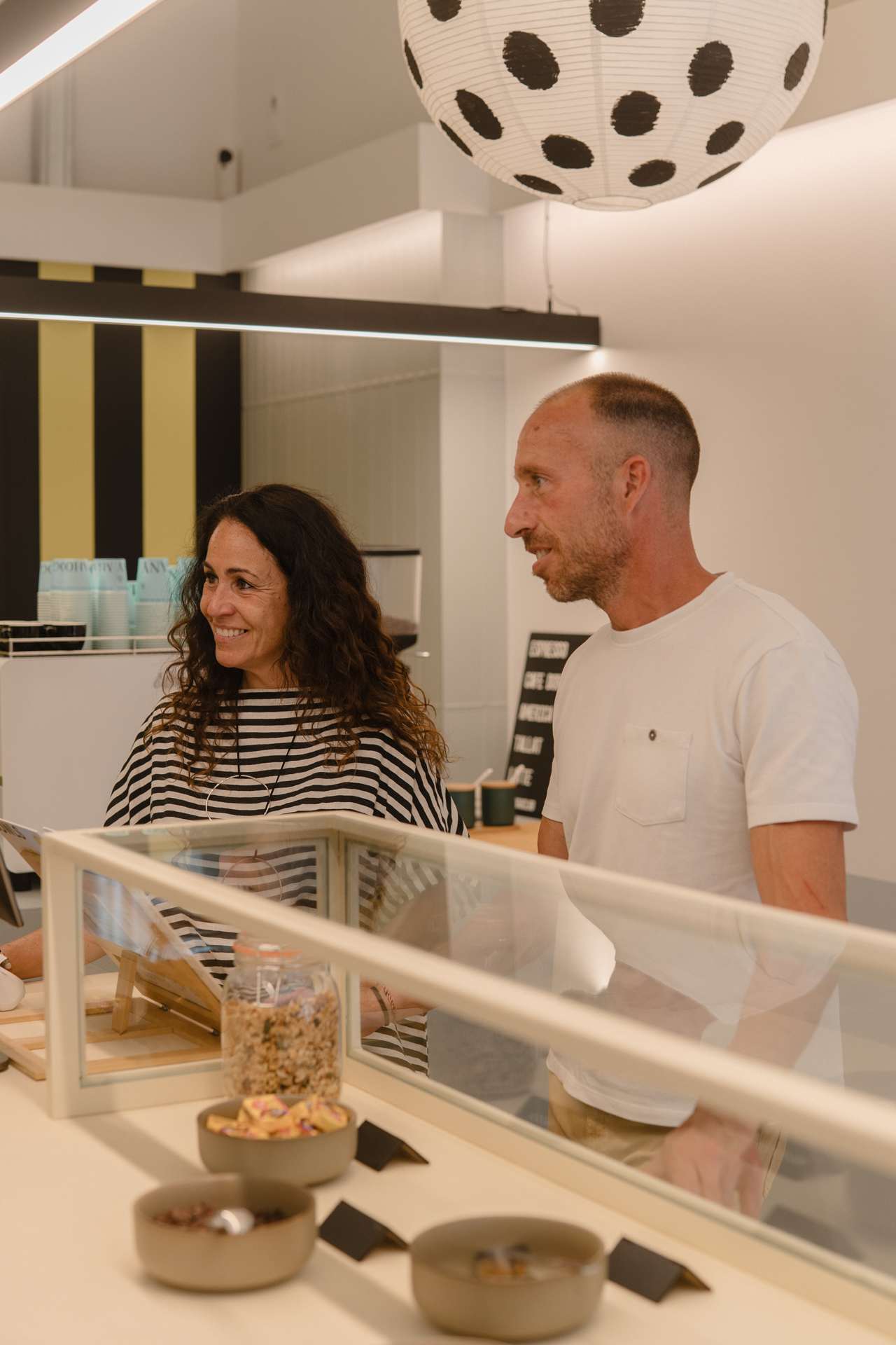
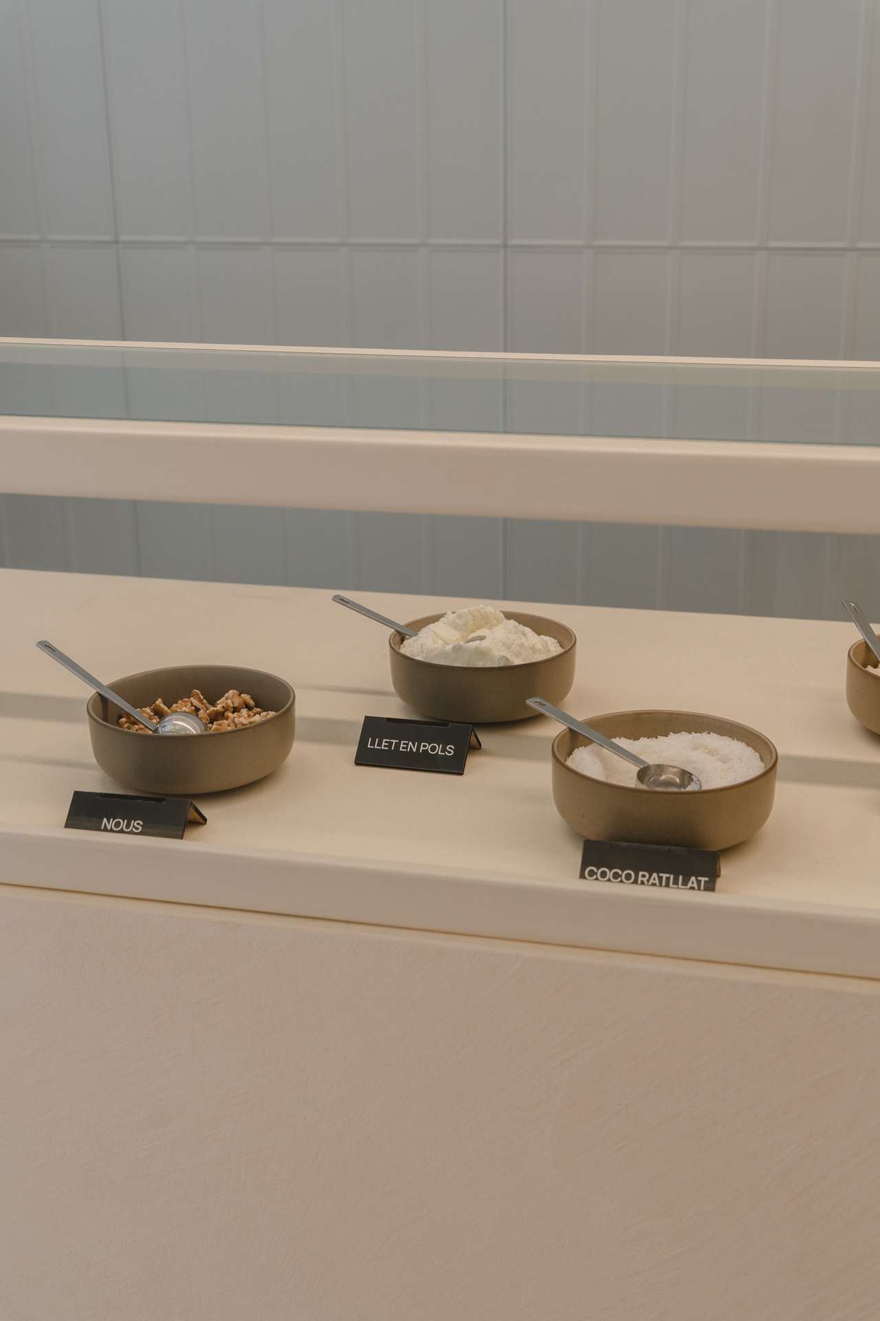
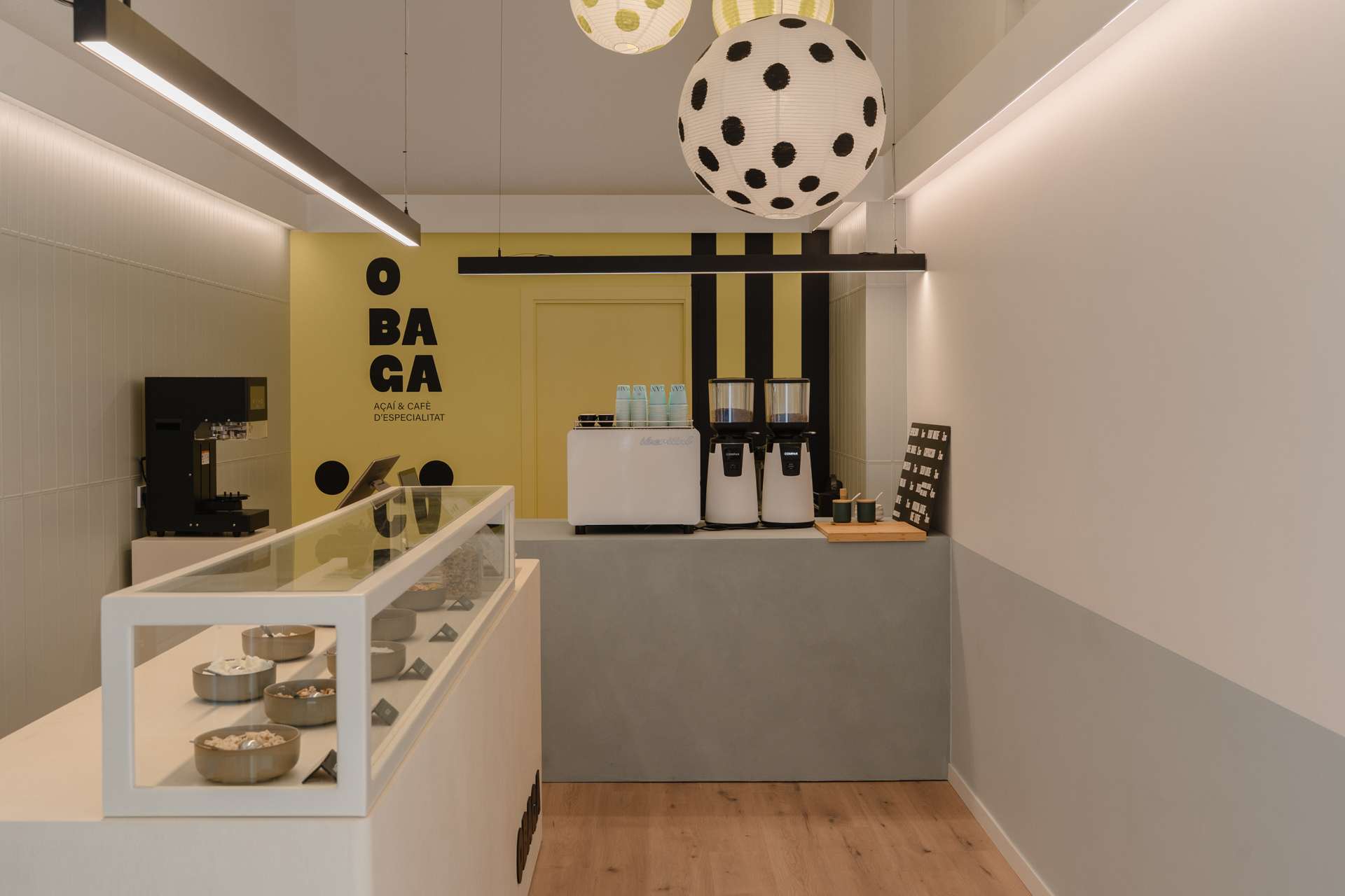
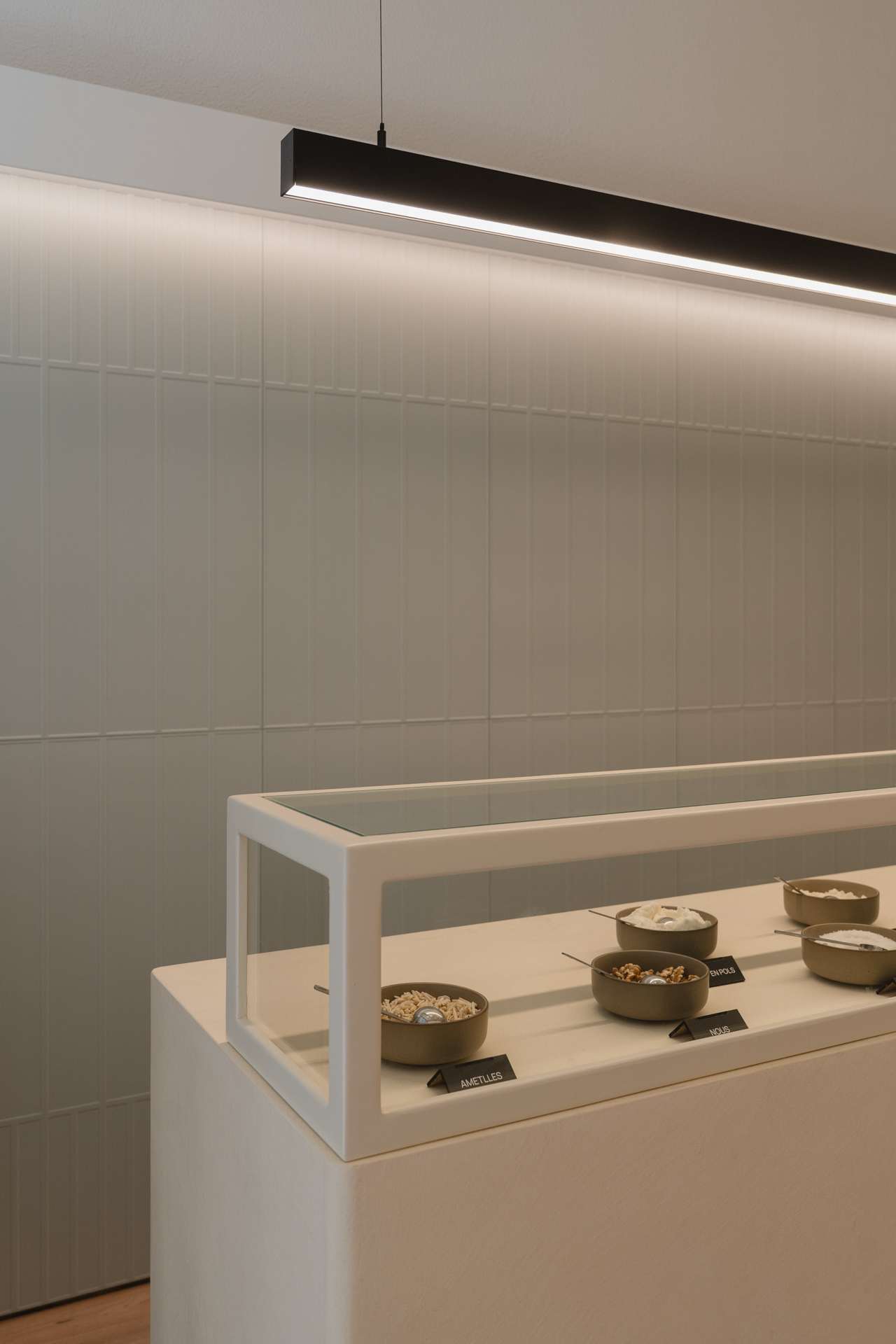
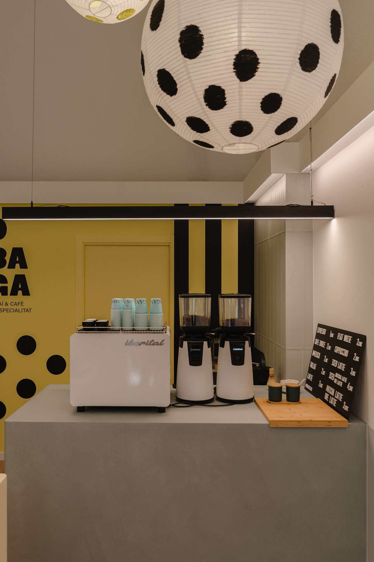
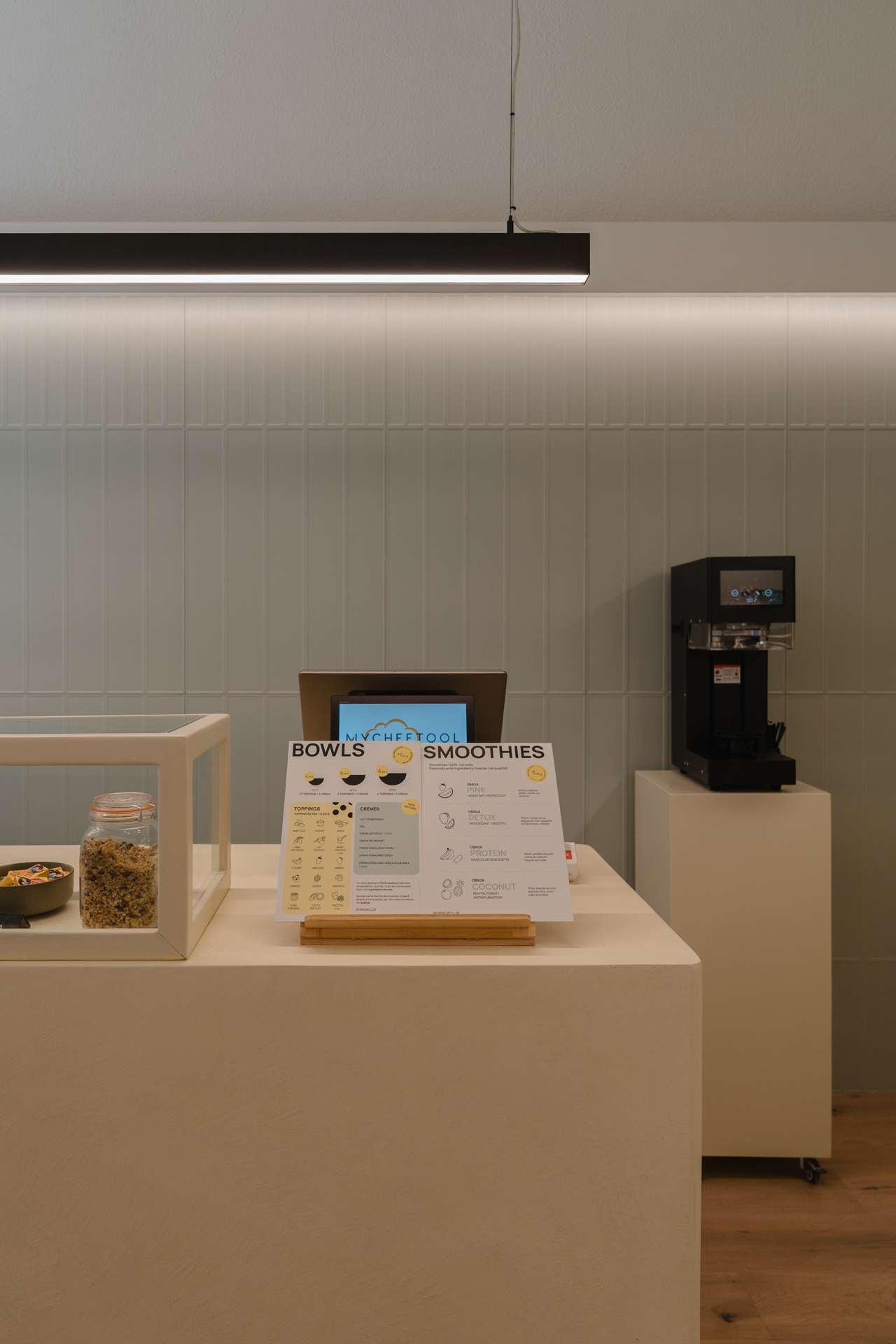
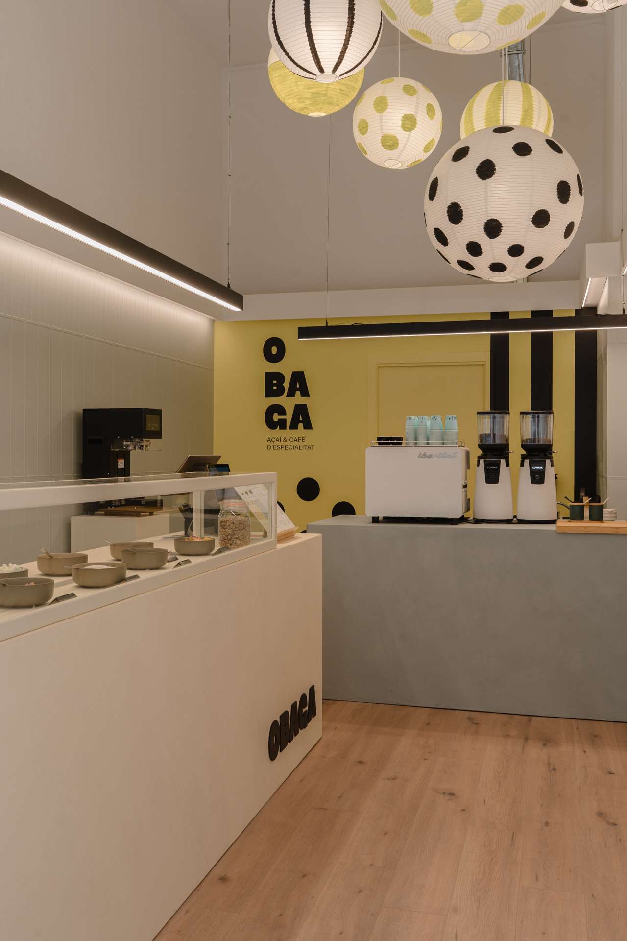
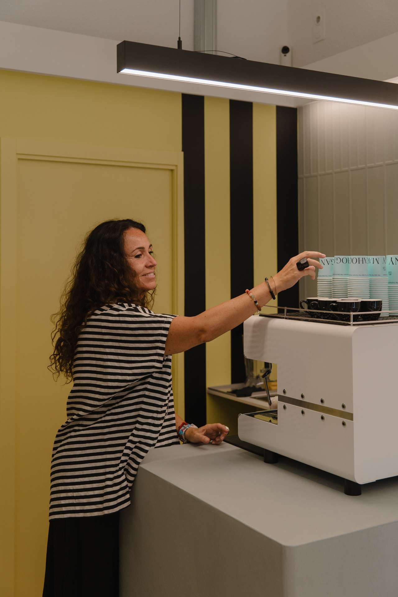
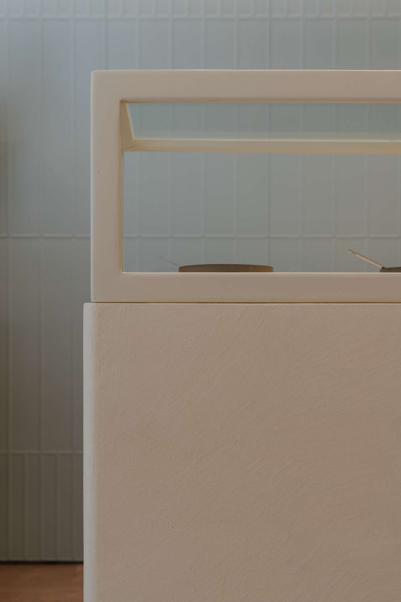
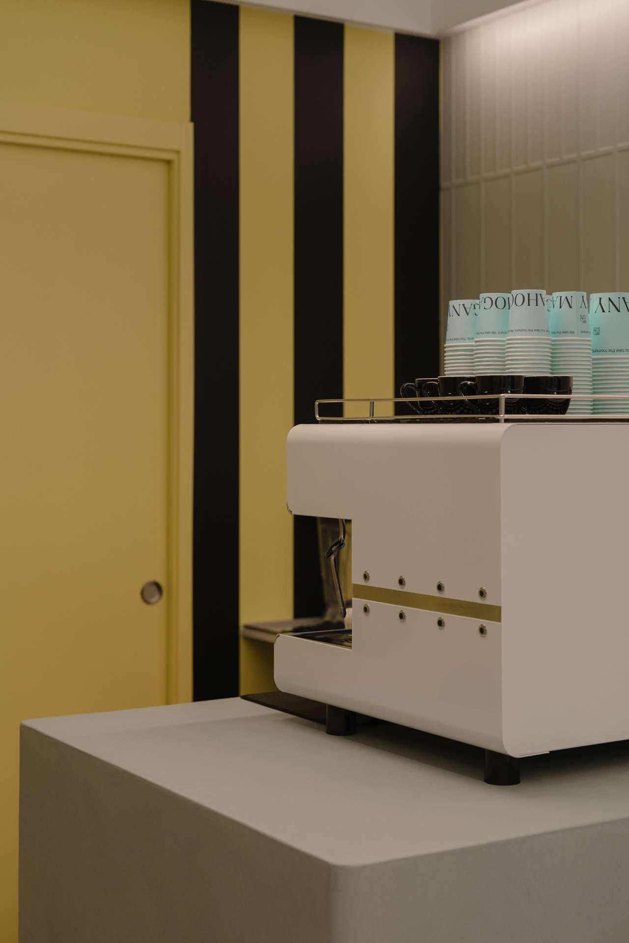
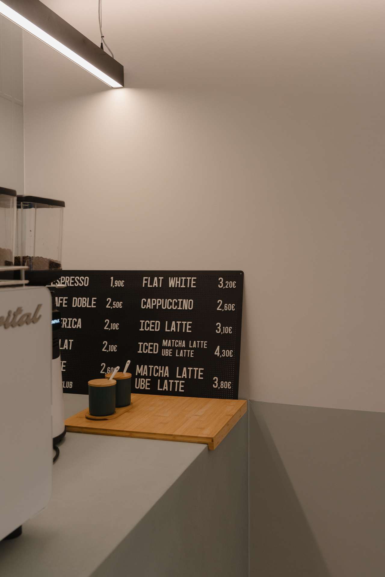
The toppings area occupies a central and highly visible position. It makes choosing easier and turns the colour and variety of the product into an aesthetic attraction. In the coffee machine and preparation area, we have paid close attention to ergonomics and efficiency, enabling a smooth service even during the busiest periods. In this way, layout, display and operations work together to improve both the purchasing experience and the running of the business.
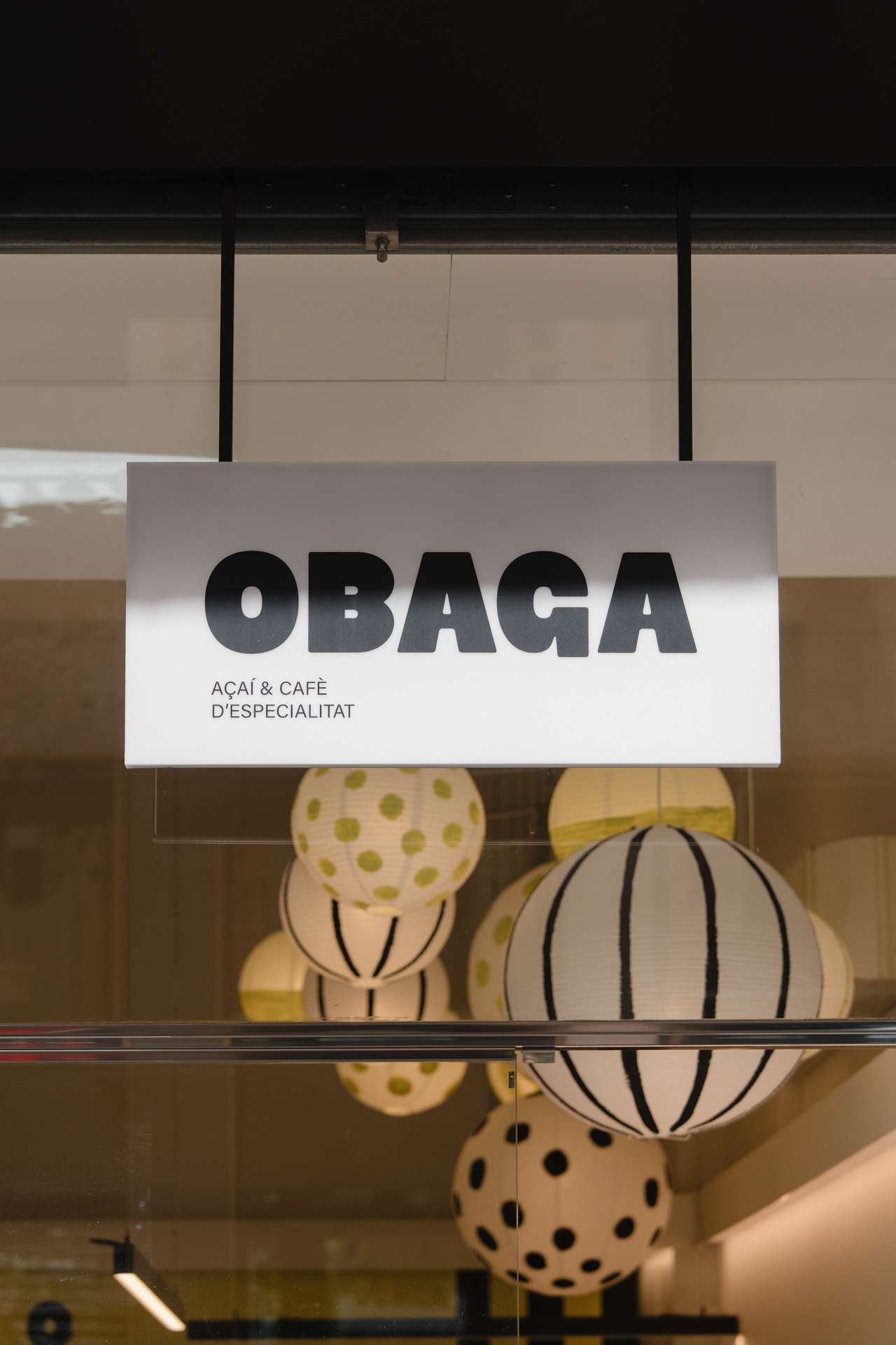
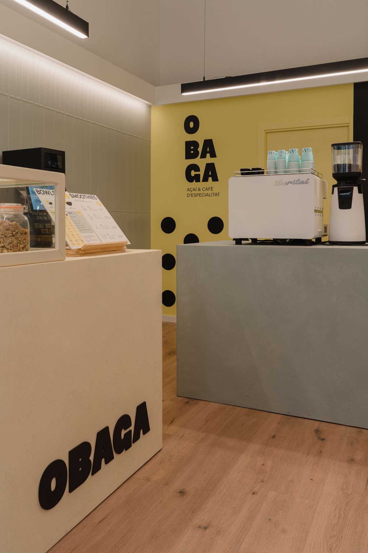
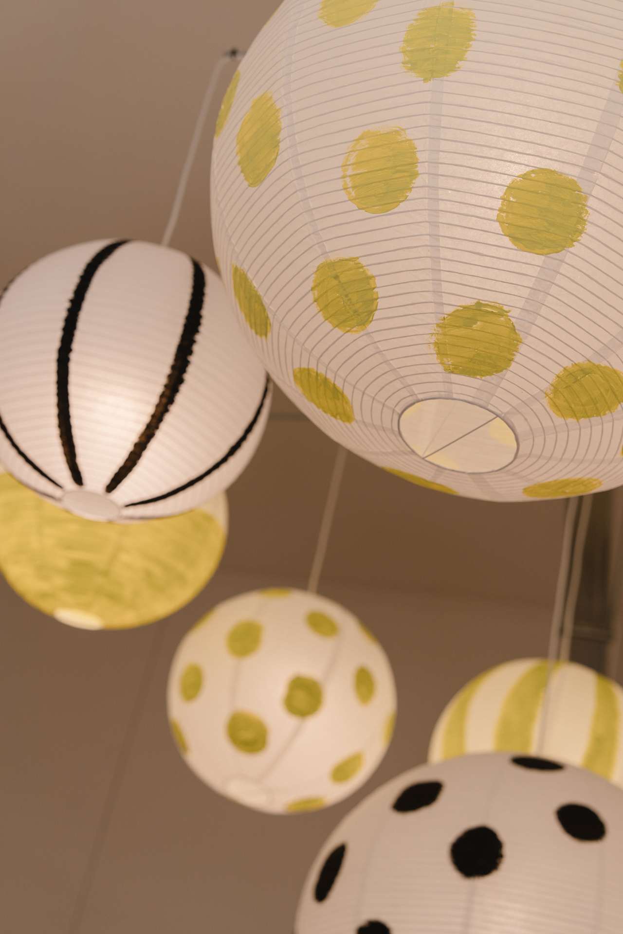
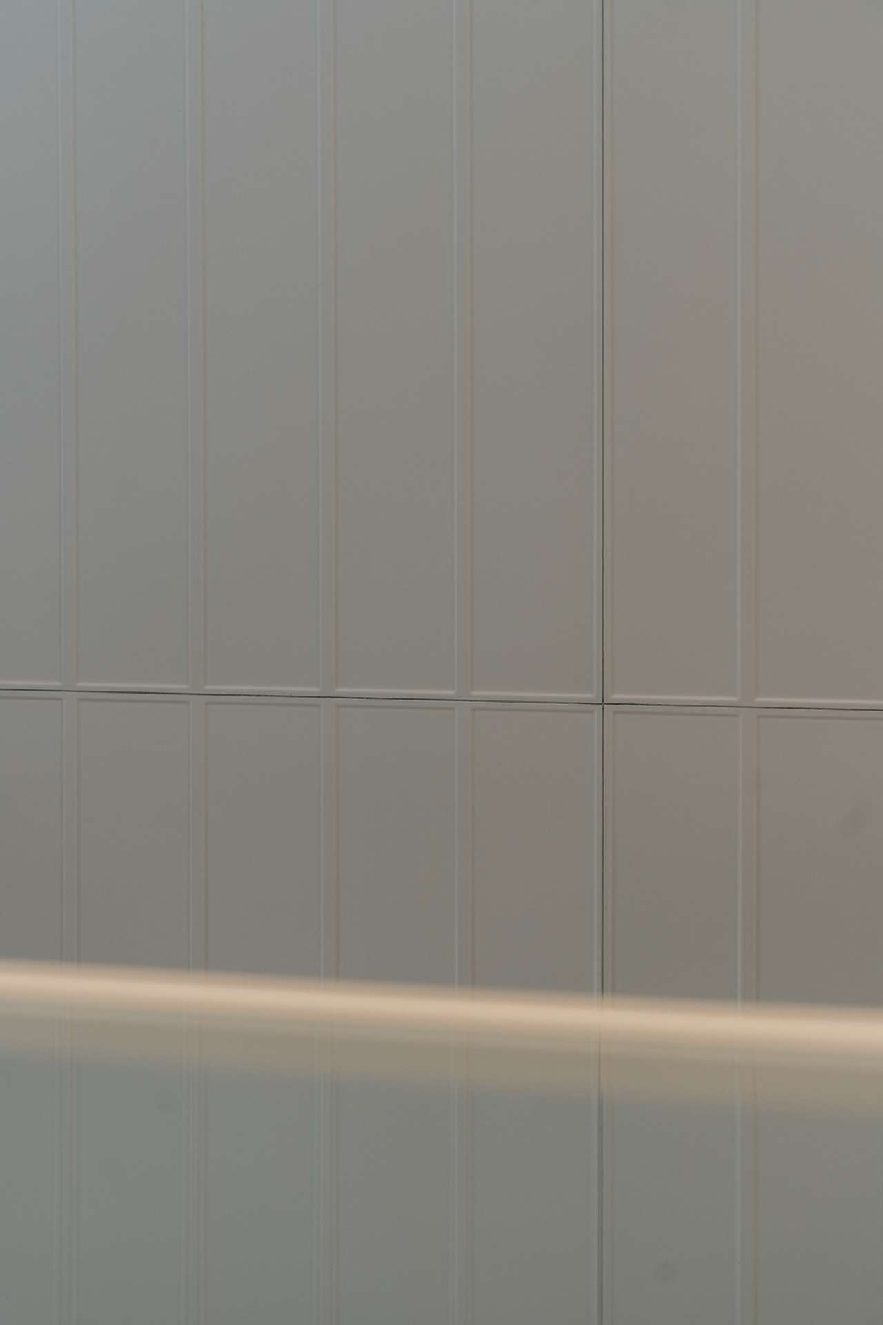
The visual identity is carried through into the interior design with a casual and relaxed graphic language. Stripes, dots and brand patterns appear in the wall textures and in the lamps designed and handcrafted specifically for the project. The contrast between yellow and black adds character, while the turquoise tile covering combines with yellow and light beige to introduce rhythm, light and depth.
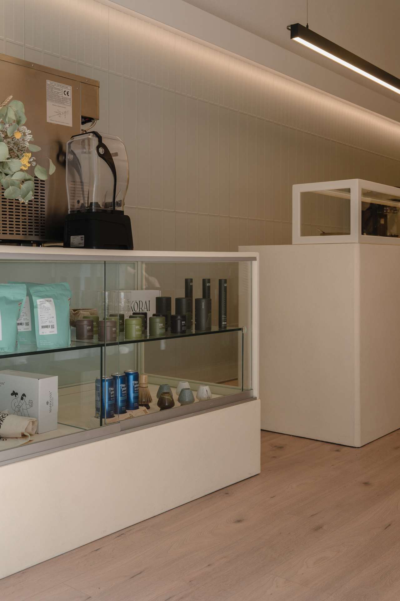
At OBAGA, retail design gives continuity to the brand and makes the product visible. The result is a distinctive, recognisable and functional space, designed to turn an everyday break into a brand experience. A visual language prepared to scale and strengthen its personality.